The goal of this blog is to create a long list of facts that are important, not trivia, and that are known to be true yet are either disputed by large segments of the public or highly surprising or misunderstood by many.
Superfact 26: The disputed Hockey Stick Graph showing that recent global warming is unprecedented in the context of the past thousand years has been shown to be correct.
Initially some scientists criticized it for being wrong, and the rightwing media and think tanks, and especially politicians criticized the graph and even attacked the scientists involved accusing them of being frauds. Al Gore was harshly criticized for using the hockey stick in his documentary “an inconvenient truth”. There were congressional hearings, politicians intimidating scientists, fake scandals, threats, and lawsuits.
The propaganda campaign against the hockey stick graph succeeded in winning over the public and that included me. I was for the longest time convinced that the hockey stick graph was wrong and perhaps a fraud. I was wrong. I had been bamboozled just like large segments of the American public.
The scandal around the hockey stick curve and the related climate-gate (fake scandal) was used to question the entire concept of global warming / climate change. As you may know, the evidence clearly shows that global warming is happening and is caused by us.
It should be noted that the way Mann, Bradley, and Hughes implemented their statistical analysis was not 100% correct, but the discrepancy was very small and did not make a big difference. However, this discrepancy was very useful for their detractors.
The controversy led to an investigation resulting in the so-called North Report. The 2006 North Report published by the United States National Academy of Sciences endorsed the MBH studies with a few reservations.
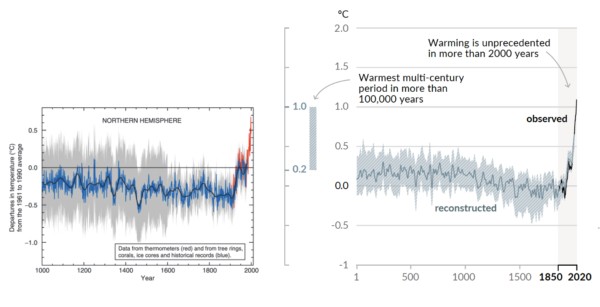
Subsequent research has resulted in more than two dozen reconstructions, using various refined statistical methods and combinations of proxy records. They are not identical to the original hockey-stick graph but closely resemble it and consistently show a slow long-term cooling trend changing into relatively rapid warming in the 20th century.
Since there is now a scientific consensus supporting the hockey stick graph, it is important news, and a lot of people still have not gotten the memo or are refusing to believe it, I consider it a super fact.
Before The Hockey Stick Graph
Before the hockey stick curve there was a lot of talk about the medieval warm period and the little ice age. Many people used these periods to cast doubt on global warming claims by scientists. I should say that the climate scientists claim about global warming was not based on the temperature record for the last 1,000 years. It was because the observed recent uptick in average global temperatures was not expected naturally.
Their worries were based on the fact that our greenhouse gas emissions could explain the uptick whilst there was no climate cycle or natural phenomenon that could explain it. That combined with the fact that the manner in which the warming was happening (it’s fingerprint if you will) showed that it was our greenhouse gases causing it.
So, the comparably high temperatures during the medieval warm period and the very cold temperatures during the little ice age should not have mattered much. But as you can see in the graph below, the old temperature graphs could be used by global warming skeptics.
It should be noted that previous estimates for the temperatures during the medieval warm period and the little ice age were based insufficient data and guesstimates.
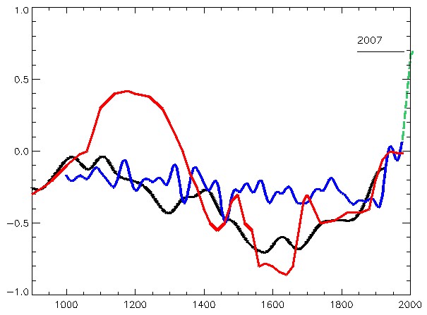
The graph below from the 1990 IPCC report shows three curves, a red, a blue and a black one, and a green extension to the blue from 1998 to 2007. The red graph shows a large bulge corresponding to the medieval warm period, a significant drop corresponding to the little ice age, and a minor uptick in recent temperatures. The blue curve shows a flattened medieval warm period with only a minor little ice age and sharper uptick in recent temperatures. The green extension stretching from 1998 to 2007 shows a significantly sharper uptick in temperatures. The black curve is an alternative temperature curve by Moberg.
As you can see the estimates for the average global temperatures during the medieval warm period and little ice age were too large. When the hockey stick curve came along (next graph), a propaganda tool was diminished, which led to the media storm.
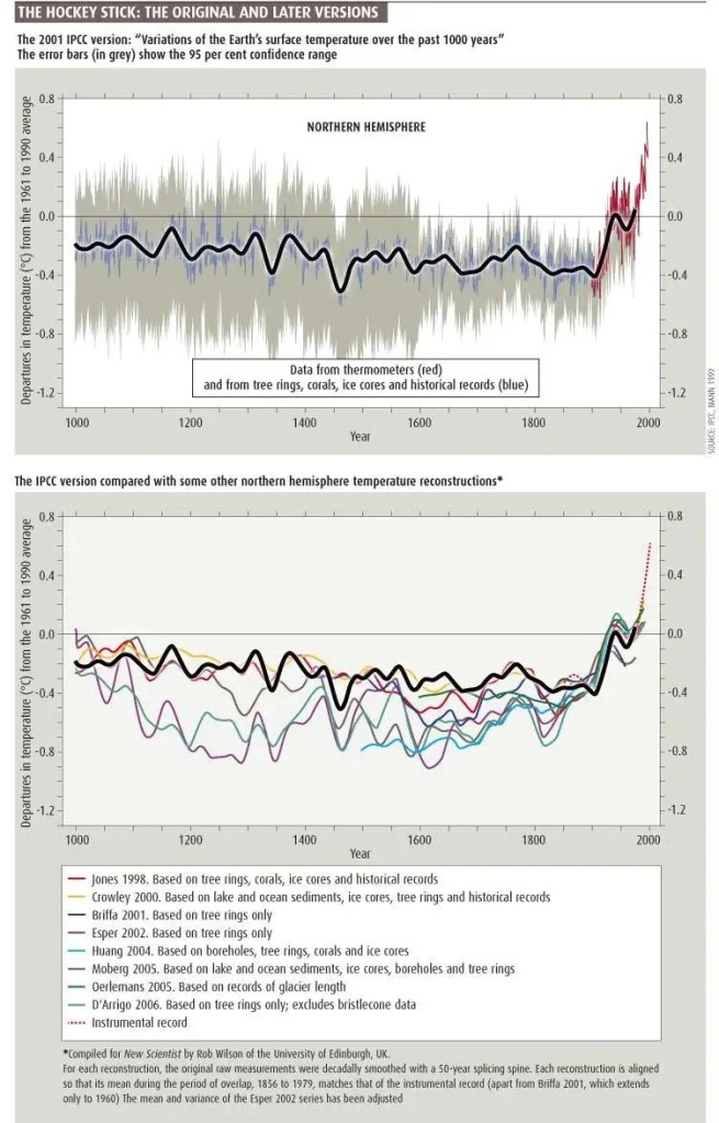
The red line is from the 1990 IPCC report and shows what was believed at the time about temperatures during the last 1,000 years. The blue line is the (MBH) hockey stick graph from 1998. Graph taken from this page. William M. Connolley derivative work: Dave souza, CC BY-SA 3.0 <http://creativecommons.org/licenses/by-sa/3.0/>, via Wikimedia CommonsThe so-called hockey stick curve depicting the last 1,000 years. The blue line is the first hockey stick curve ever created (by Michael Mann). He used proxy measurements such as tree rings, green-dots 30-year average, red temperature measurements. Wikimedia commons <<https://creativecommons.org/licenses/by-sa/4.0/deed.en>>. This graph is taken from this page.
Multiple Hockey Stick Graphs
As mentioned, various refined statistical methods and combinations of proxy records, has resulted in another couple of dozen hockey stick curves that largely agree with the original MBH hockey curve. Below are a few examples taken from various sources. The first two graphs below are taken from the real climate website, a website created by climate scientists.
IPCC 3rd Assessment Report
Side-by-side comparison of the (left) original Mann et al (1999) “Hockey Stick” reconstruction as featured in the Summary for Policy Makers of the IPCC 3rd Assessment report (2001) and the (right) longer, sharper “Hockey Stick” as featured in the Summary for Policy Makers of the IPCC 6th Assessment report (2021).
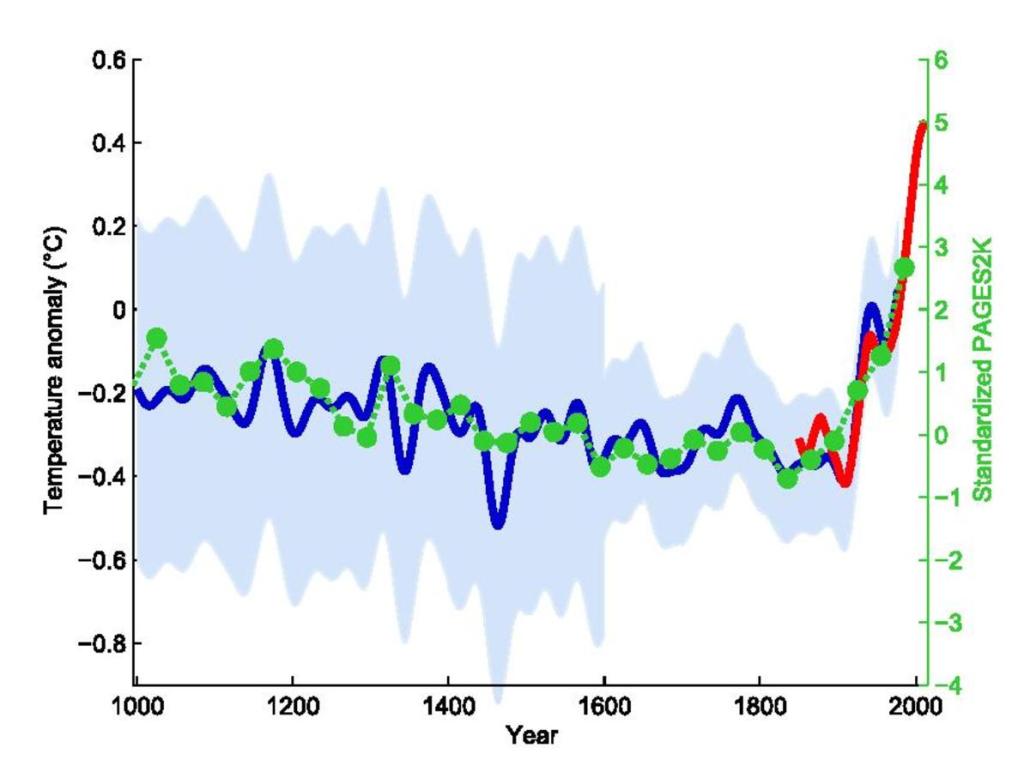
Eight Hockey Sticks by New Scientist
The graphics below are focused on the northern hemisphere. The top graph shows the 2001 IPCC hockey stick curve with data from thermometers (in red). Below that graph are eight more hockey stick curves plus a red dotted line corresponding to the instrumental record. This was compiled for New Scientist by Rob Wilson of the University of Edinburgh, UK.
The top graph shows the 2001 IPCC version of the hockey stick curve stretching back 1,000 years. The error bars (in grey) show the 95% confidence range. The blue line is from tree rings, corals, ice cores and historical records. All curves correspond to the departures in temperatures in centigrade from the 1961 to the 1990 average.
The Hockey Stick Wars
I also wanted to add a few examples related to the propaganda wars against the first hockey stick graph and its author Dr. Michael Mann and climate science in general. If you haven’t followed this topic, I can add that it did get intense.
On April 23, 2010, Virginia Attorney General Ken Cuccinelli issued a Civil Investigative Demand (CID) to the University of Virginia (UVA). The CID demanded that UVA provide every email, record, or document it had related to Dr. Mann from his time there from 1999 to 2005. This resulted in a strong reaction from the scientific community.
On 2 March 2012 the Supreme Court ruled that Cuccinelli as Attorney General had no legal authority to demand the records from the university. Dr. Mann was also severely harassed and received chilling death threats against himself as well as his family, as documented in his book “The Hockey Stick and the Climate Wars: Dispatches from the Front Lines”.
In February 2024, Michael Mann won a defamation lawsuit against conservative writers Rand Simberg and Mark Steyn (Mann v. Competitive Enterprise Institute). The jury awarded Mann $1 million in punitive damages and $1 in compensatory damages. The lawsuit was over blog posts written by Simberg and Steyn that accused Mann of manipulating data in his famous “hockey stick” graph. It was not so much about questioning the science but rather about the fact that they intentionally tried to ruin his reputation using false information.
For example, they were comparing him to the infamous pedophile Jerry Sandusky. Jerry Sandusky was a football coach at Penn State University and Dr. Michael Mann is a distinguished Professor of Atmospheric Science at Penn State.
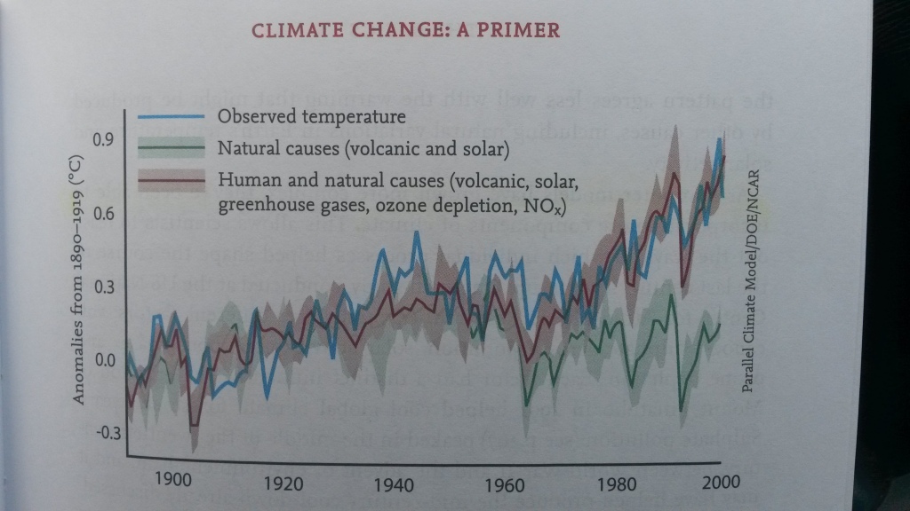
Superfact 25: Global warming is happening. Or if you call it Climate Change or Climate Disruption is happening. And it is happening very fast. We also know that it is caused by us primarily as a result of our burning of fossil fuels. There is a long-standing scientific consensus on these two facts because the evidence is conclusive. Check the evidence below.
This is a long post. However, I summarized this somewhat complex issue in a post I hope is both comprehensive and easy to read at the same time. I believe you can learn a lot from reading it. Note in this post, Global Warming Is Happening And Is Caused By Us, I will use the terms climate change, climate disruption and global warming interchangeably, or nearly interchangeably. I am doing that on purpose.
A lot of people would like to dispute this fact. Including large segments of the public, politicians, and political organizations. I was once a so-called skeptic myself. However, climate scientists very rarely dispute this because of the large amount of compelling evidence. This is a good summary from NASA. We know it’s true, it is important, yet disputed, which makes it a super fact in my opinion.
Below I created a top 10 list of evidence for the fact that climate change / global warming is happening. As well as a top 10 list of evidence for the fact that we are the cause for it. Primarily because of our burning of fossil fuels.
Evidence that Global Warning is Happening
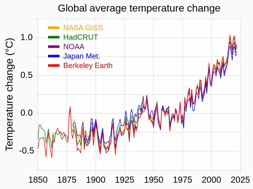
(1) The temperature records collected by numerous organizations show that global warming is happening. Organizations such as NASA, NOAA, the Hadley Centre, the European Centre for Medium-Range Weather Forecasts, the Japanese Meteorological Agency, the World Meteorological Organization, and many more, use data from land-based weather stations, ocean buoys, satellite measurements, and other sources to monitor Earth’s climate. Comparison with the palaeoclimatological record shows that the rise in average global temperatures is extremely fast. This is the smoking gun. However, for those who question the data from all of these organizations there are other simpler types of evidence (see below).
(2) Global sea levels has increased by 20–25 cm (8–10 in) since 1900, with half of that increase occurring since 1980. Sea level rise occurs from a combination of thermal expansion and the melting of land ice, both which happen as a result of warming. This sea level rise has been the fastest in “at least the last 3000 years”.
(5) The Antarctic ice sheet is losing ice at a rate of about 100–200 billion tons per year, which has increased in the past two decades.
(6) Eco zones are generally shifting northward and to higher elevations, meaning that plant and animal habitats are moving towards cooler regions as temperatures rise in previously suitable areas.
(8) Extreme events are increasing in frequency showing that climate is changing
(9) After extensive research and scientific debates in the past there is now a long-standing scientific consensus that Global Warming is happening. This is not physical evidence itself, but it does not an appeal to authority fallacy either. Think about it in terms of probability.
(10) Old guys originating from northern climates like me, have noticed that the seasons are changing. Even if you dismiss all the evidence from NASA, NOAA, IPCC, and all the world’s meteorological institutions, and you claim that all the world’s climate scientists are all in a massive conspiracy, you cannot convince me of something that is contrary to what I can see with my own eyes.
Graphs and Videos Showing Global Warming
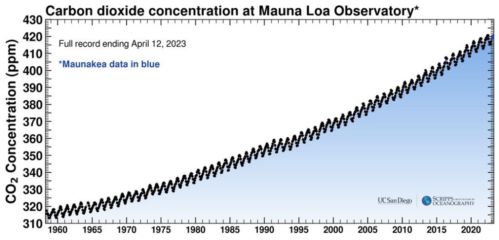
To see the NASA web page from where the YouTube video of the shrinking arctic ice is taken click here .Temperature anomaly graphs from NASA, Hedley Center, Japan Meteorological Agency, NOAA, and Berkley. Wikimedia commons << https://creativecommons.org/licenses/by-sa/4.0/deed.en>>.The so-called hockey stick curve depicting the last 1,000 years. The blue line is the first hockey stick curve ever created (by Michael Mann). He used proxy measurements such as tree rings, green-dots 30-year average, red temperature measurements. Wikimedia commons <<https://creativecommons.org/licenses/by-sa/4.0/deed.en>>. This graph is taken from this pageTemperature record for the last 150,000 years. Notice the sharp uptick towards the end. This picture is taken from this article.
Confusion About Climate Change
Before continuing I would like to address a couple of issues that sometimes trip up people. And prevent them from learning about this topic.
The question “climate has always been changing, why would we be the cause now?”, is a good question. If asked honestly. However, it is a bad question if it is asked like a gotcha or a dismissive statement. In this case it is a bad question. Because the paleoclimatologists and the climate scientists, in other words the experts on past climate, are the ones telling us that the current climate change / global warming is caused by us, it is not “natural”. They obviously say that because they know something that the dismissive laymen don’t. All everyone needs is a tiny bit of reflection to realize that you’ve got something to learn from them.
Sometimes you come across people who have a hangup over the fact that we use a few different terms interchangeably, global warming, climate change, climate disruption, inadvertent climate modification, etc. The people who have a hangup about this jump to the incorrect conclusion that there is some sort of deception or backtrack going on. If I talk about my dog and my mini-Australian Shepherd, I am not confused or deceptive or backtracking anything. It is the same family member. Whether you call it global warming or climate change or something else is a distracting non-issue, a red herring if you will.
To add some information about it. Climate change has become the more popular term recently, but the terms climate change and inadvertent climate modification predates the term global warming, which became popular in the 1980’s largely because climate scientist James Hansen likes to use it. Climate change is a broader term since it could include global warming and global cooling, but in the current context, global warming is a good term as well since that is what is happening now.
One advantage of the term climate change is that the average warming trend is in itself not the major issue. The effects on the overall climate that warming has is the more important issue. You could say that you want some global warming when the weather is cold and it would make sense. But you don’t want the destruction of eco systems, oceanic and atmospheric circulation changes, sea level rise, worse storms, draughts, floods, wildfires, etc., that it causes.
Natural Causes of Climate Change
There are many different kinds of natural causes of climate change. Two billion years ago cyanobacteria developed a form of photosynthesis that absorbed carbon dioxide and emitted oxygen, as well as a way of extracting nitrogen using a process called nitrogen fixation. This made cyanobacteria extremely successful. One consequence of this was that the carbon dioxide was largely removed from the atmosphere, and the earth got very cold, but the oxygen that was now present in the atmosphere paved the way for the existence of multicellular life and animals. To find out more about this, read this book.
The planet changed but it took millions of years. The emergence of land plants did something similar. Examples of other slow-moving drivers of climate change are continental drift and the fact that the light from the sun has gotten 6% stronger over the last one billion years (0.006% per million years).
Cyanobacteria caused a global cooling two billion years ago while paving the way for the existence of multicellular life and animals. Stock Photo ID: 2197045895 by Andre Engelhardt.
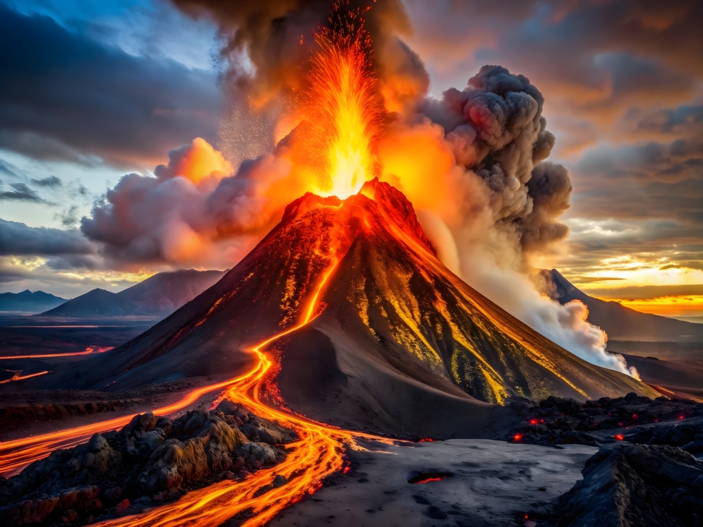
65 million years ago an asteroid struck earth, which caused earth’s climate to change, which is probably what killed the non-avian dinosaurs. Another example of a past climate change driver is unusual volcanic activity. Volcanoes emit greenhouse gases, such as carbon dioxide (CO₂) and water vapor, during eruptions.
However, their contribution to the total CO₂ emissions in modern times is very small compared to human activities. Annual volcanic CO₂ emissions are estimated to be around 200-500 million tons while humans add 37-40 billion tons, or 100 times as much. Therefore, it is unlikely that volcanoes contribute much to the current warming, but the fine sulfate aerosols emitted by volcanoes can cause a significant cooling effect for a few years.
Dinosaur and asteroids during extinction day Stock Illustration ID: 1438260563 by serpebluVolcano – An active volcano that erupts lava. Stock Illustration ID: 2497156167 by MERT1995
One type of important type of climate forcing that’s been the cause behind the multiple ice ages that we’ve had over the last two million years are earth’s orbital cycles, or the Milankovitch cycles. There are three of them, orbital eccentricity, change in axial tilt, and axial precession. Could they explain the current warming? No, they can’t because we are currently in a cycle that should be cooling the planet. And it was until now. Below I have included a video from PBS that explains these orbital cycles.
Illustration of Milankovitch cycles from MIT’s Climate Primer.<< Link-22>>.
From PBS explanation and overview of earth’s three orbital cycles.
There are also short-term solar irradiance cycles. There is an 11-year cycle and an 80-year cycle, but these correspond to small changes. The 11-year cycle corresponds to a temperature change of 0.05 degrees Celsius.
In addition, the Sun’s irradiance has been slightly decreasing over the past few decades. Changes in the sun’s irradiance cannot explain the sharp warming we are witnessing. As you’ve seen above, neither can volcanic activity nor any known orbital cycles, slow moving climate drivers such as continental drift cannot explain it and we did not get hit by an asteroid recently. However, what fits the bill almost perfectly is our greenhouse gas emissions.
Unlike weather, the climate is not particularly sensitive to initial conditions (chaos). For example, we can be pretty certain that July will be warmer than January in Minnesota. We use climate models to try to predict future climate. All climate models rely on the laws of thermodynamics. But they vary in regard to the different understandings of the best ways to incorporate those laws in a representation of all of Earth. They do not come up with identical results. But they all get the average temperature of each region of the world right.
In addition, the various old climate models from the 1990’s do a very good job of what has happened during the last 30 years. They aren’t perfect but they are useful and more importantly for our context they serve as powerful evidence that the current warming is caused by our emissions. You remove our emissions from the models and none of what we measure will happen. Climate models are therefore the smoking gun with respect to what is causing global warming, just like the temperature record is for the fact that it is happening in the first place.
Unfortunately, the climate models have been maligned and misrepresented by those who wish that the public do not pay attention to them. That’s why we need to mention additional types of evidence (see below).
Evidence that Global Warming is Caused by US
(1) Climate models – as we have seen above, climate models are the smoking gun evidence that we humans are causing global warming / climate change. In addition, both simplistic and complex climate models show that 100% of global warming is caused by humans.
(3) The upper troposphere is cooling, which shows that the heating is from greenhouse gases and not the sun or orbital cycles. To understand how the lower atmosphere is warming while the upper is cooling, think of the greenhouse gases as a blanket.
(4) winters and nights are generally warming faster than other seasons and times of day due to the increased presence of greenhouse gases in the atmosphere, which trap heat more effectively during colder periods. This is considered a key indicator of human-induced climate change.
(5) The speed of the warming, 0.31 degrees Fahrenheit per decade, or 0.17 degrees Celsius per decade is extremely fast. Known natural climate forcing tends to be slower.
(6) Human activities is the only known explanation for the current global warming. One way that we know that the current warming is caused by human activity is because we are currently in a cycle that should be cooling the planet. The same is true for the sun’s irradiance. It is not volcanoes or any other known cause. See the section above called “Natural Causes of Climate Change”.
(7) Isotope studies show that the origin of the greenhouse gases added to the atmosphere are from burning fossil fuels. This is referred to as the isotopic footprint.
(8) The observed temperature rise mirrors industrialization.
(9) More than 90% of excess heat from global warming is absorbed by the oceans, causing significant increases in ocean temperatures. Oceans absorb about a quarter of human CO₂ emissions, leading to lower pH levels. This is unprecedented in at least 26,000 years and is directly linked to anthropogenic CO₂. These effects have been carefully studied and observed.
This is a short one-minute overview of the causes behind global warming that is happening.
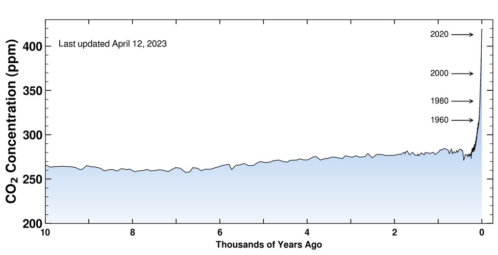
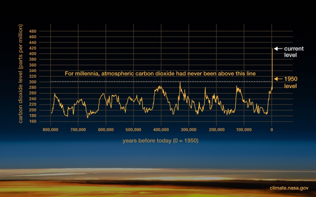
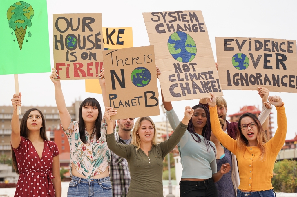
This video from NASA is a bit longer, 13 minutes. Click here to see the page this is coming fromNatural causes for global warming / climate change would have cooled the planet, not warm it. Click here to visit this NASA web page regarding the causes behind global warming.<<Link-31>>The carbon dioxide concentration measurements began in 1958 at the Mauna Loa Observatory on the island of Hawaii. Since then, several other ways of measuring carbon dioxide concentration have been added.From Scripps institute. Keep two things in mind. First the warming from CO2 is delayed and may result in positive feedback that can manifest decades and centuries later. Secondly, human civilization developed during a period of stable climate. That CO2 levels and temperatures were higher millions of years ago is not much comfort.Going back 800,000 years. From Scripps institute.A Global Warming protest. It’s their future. Stock Photo ID: 1427361263 by manpeppe
Superfact 24: Smallpox killed 300 million people in the 20th century. However, there have been no naturally occurring cases of smallpox since 1977, and the world was declared free of smallpox on May 8, 1980, by the 33rd World Health Assembly.
Smallpox vaccine Stock Illustration ID: 1782022109 by Novikov Aleksey
300 million people is an astonishing number. It is six times the 50 million people who died from the Spanish flu. It is about four times as many people as the 70 to 85 million people who died in World War II. It is close to the entire current population of the United States. That’s how many people died from this very dangerous disease. It was eradicated by a vaccination campaign.
I think this fact qualify as a super-fact, first of all because of the astonishingly huge number of deaths but also for the fact that it is gone. It is hard to believe that this happened. It is hard to believe that the world has changed so drastically for the better. It is a shocking but true fact. Thanks to the vaccination campaign we are living in a much better world.
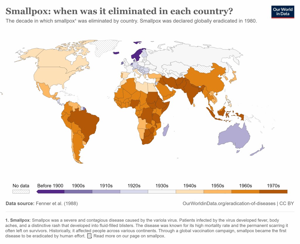
This world map shows when smallpox was eradicated from different countries. The source is Our World in Data, originally Fenner et al. at CDC.
What is Smallpox?
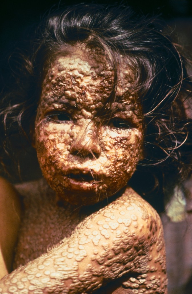
Smallpox is an infectious disease caused by the variola virus<<Link-1>>. The last naturally occurring case was diagnosed in October 1977, and the World Health Organization (WHO) certified the global eradication of the disease in 1980. The disease begins with fever and vomiting followed by the formation of ulcers in the mouth and a skin rash that later turns into fluid filled blisters with a dent in the middle. These blisters get scabbed and leave scars. The death rate was about 30%.
Child with smallpox in Bangladesh 1975. Wikimedia commons photo by CDC/James Hicks.
The Eradication of Smallpox and Vaccines
The smallpox vaccine has a long history that begin in China where smallpox inoculation had existed long before it did in Europe. In 1796 the English physician Edward Jenner demonstrated the effectiveness of cowpox to protect humans from smallpox. Soon after several countries enacted mandatory vaccinations.
In 1807, Bavaria became the first country in the world to introduce compulsory vaccinations. In 1958 the World Health Assembly was called upon to eradicate smallpox. At this point 2 million people still died from smallpox every year. In 1967 the World Health Organization intensified the global smallpox eradication. As mentioned, smallpox was eradicated at the end of the 1970’s.
In 1998 & 2002 vaccination was dealt a blow by the Wakefield studies claiming that the MMR vaccine caused autism. Even though the studies were debunked, and several later studies showed no link between the MMR vaccines and autism, the fear of vaccines began to spread.
For example, in 2024 the American Veterinary Medical Association reported 37% of the dog owners surveyed believe canine vaccination could cause autism in their dogs. Not only is there no link between vaccines and autism, but technically speaking, dogs cannot be autistic as the condition is unique to humans. Unfortunately, the unnecessary fear of vaccines causing autism seems to only be getting worse.
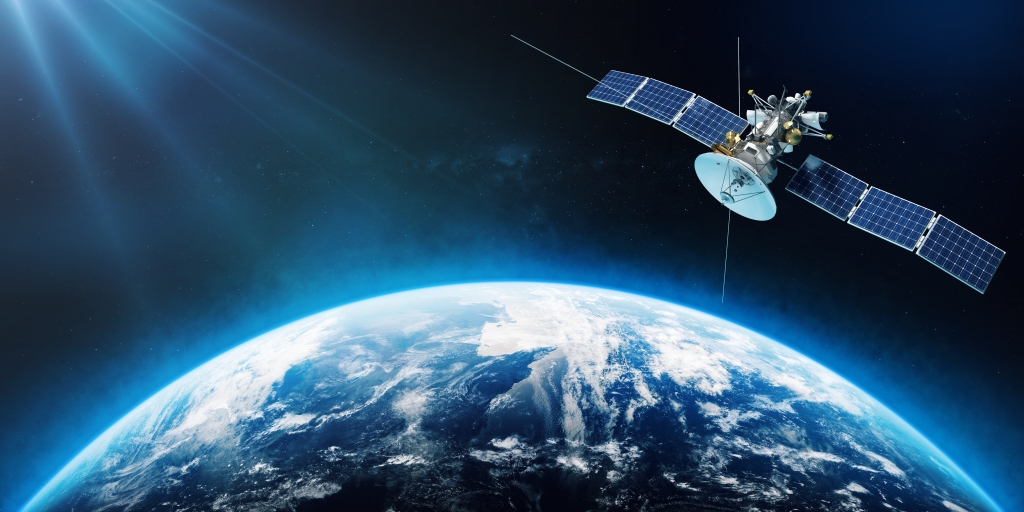
Superfact 23: GPS uses relativity for accuracy. Global Positioning Systems or GPS uses Special Relativity and General Relativity to guide you to your destination. In fact, GPS systems would be rendered useless without the Theories of Relativity.
Stock Photo ID: 2502019165 by mayam_studio
Did you use Einstein’s Theories of Relativity to get to the grocery store today?
Therefore, it is a bit surprising that without the theories of relativity the GPS app on your phone would not be able to guide you to the grocery store. That’s why I call it a super fact that GPS uses relativity for accuracy.
Stock Illustration ID: 1372134458 by Boris Rabtsevich
The GPS system needs to calculate precisely the time it takes for signals to travel from the satellites to a receiver on Earth for it to work. GPS satellites travel at high speeds causing a large enough time dilation that has to be accounted for. In addition, they orbit earth high above earth’s surface where earth’s gravitational field is weaker than on earth’s surface. Clocks run faster in weaker gravitational fields due to gravitational time dilation, so you must correct that as well.
If you ignore relativity, you will accumulate a discrepancy of six miles in one day. You are not going to find the grocery store that way, unless you use the old-fashioned method of reading a map. In a sense, if your GPS device finds the grocery store for you, you have proven Einstein right.
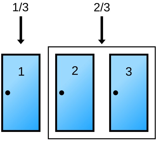
Superfact 22: Suppose you’re on a game show, and you’re given the choice between three doors: Behind one door is a car; behind the other two doors there are goats. You want to pick the car. You pick a door, and the host, who knows what’s behind the three doors, opens another door revealing a goat. Now the question is, is it to your advantage to switch door choice? The answer is yes. And that is the surprising Monty Hall Problem.
The Monty Hall gameshow Three Doors Problem. There is a car behind one door, and goats behind the other two. You pick a door. Monty Hall, the gameshow host, opens one of the other doors and it has a goat. Should you change your choice of door? Yes, you should. But why? – Monty Hall Problem Stock Illustration ID: 1881849649 by SATYA94.
It is quite common to argue that it does not matter. You don’t know what is behind the two remaining doors so it should be 50/50 right? In a test involving 228 people only 13% chose to switch. However, you should switch.
Monty Hall, the gameshow host of the Let’s Make a Deal television game show, knows where the car is, so he never chooses the door with the car. And by curating the remaining two doors for you, he raises the odds that switching is always a good bet. By switching your choice, you have a 2/3 chance of winning the car but if you stay with your original choice, you only have a 1/3 chance of winning the car.
So why is this a super-fact? First, we know it is true. It is mathematically proven and experimentally verified that switching door is the best choice. Secondly, this was widely contested and is still surprising to people. Finally, probabilistic thinking is the key to being rational and making good decisions. This fact is true, important and disputed and thus a super fact.
One way of viewing the situation is by noting that there is a 1/3 chance that the car is behind any door that the contestant picks and a 2/3 chance that the car is behind one of the other two doors.
The car has a 1/3 chance of being behind the contestant’s pick and a 2/3 chance of being behind the other two doors. Picture from Wikimedia commons public domain.
If Monty opens one of the two doors that the contestant did not pick there is still a 1/3 probability that the car is behind the door the contestant picked and a 2/3 chance that the car is behind one of the other two doors. However, one of the doors that the contestant did not pick is now known to feature a goat. Therefore, the probability that the car is behind the other door is 2/3.
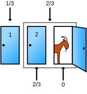
The host opens a door. The odds for the two sets don’t change but the odds become 0 for the open door and 2/3 for the closed door. Picture from Wikimedia commons public domain.
The table below is probably (no pun intended) a better way of illustrating the situation. In the table door 1 is the door designated to be the contestant’s first choice. Monty opens one of the remaining doors that has a goat behind it.
Behind door 1
Behind door 2
Behind door 3
Result if staying at door 1
Result if switching to door offered.
Goat
Goat
Car
Wins goat
Wins Car
Goat
Car
Goat
Wins goat
Wins Car
Car
Goat
Goat
Wins Car
Wins goat
There are various other ways of explaining the situation including Steven Pinker’s approach. It is easy to test this is real life and repeated experiments and simulations shown that if you switch you have a 2/3 chance of winning.
As an example of the controversy this probability puzzle caused was Marily Savant’s column in Parade Magazine. As a side note, Marilyn Vos Savant is the person who has the highest recorded intelligence quotient (IQ) as stated in the Guinness Book of Records. In response to a question regarding the Monty Hall game show problem she wrote that you should switch. She received letters from 10,000 readers disputing this, including 1,000 with PhDs. In the long run she prevailed.