Neanderthals Never Lived in Africa

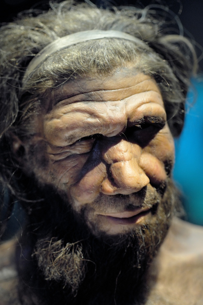
Super fact 27: Neanderthals never lived in Africa. Neanderthals, or Homo Neanderthalensis, lived in Europe and Asia but never in Africa.

Reconstruction of a Neanderthal by Natural History Museum. Werner Ustorf, CC BY-SA 2.0 <https://creativecommons.org/licenses/by-sa/2.0&gt;, via Wikimedia Commons

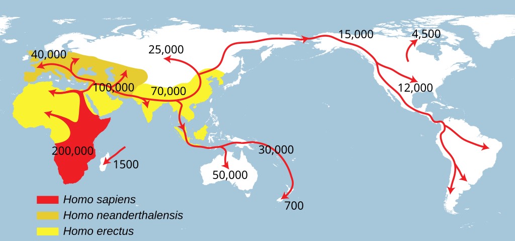
It is a common belief that humans originated in Africa. That is true but human ancestry is complicated, and in the past, there were many human species and subspecies. Starting with Homo Erectus, it is estimated that they lived between 1.6 million years ago until about 100,000 years ago.

Homo Erectus was the ancestor of Homo Heidelbergensis (between 700,000 and 200,000 years ago) as well as Homo Floresiensis (hobbit people – between 100,000 and 50,000 years ago). Homo Heidelbergensis in turn was the ancestor of (at least) three homo species, Homo Sapiens (between 300,000 until now), Homo Neanderthalensis (between 400,000 to 40,000 years ago),  and Homo Denisova 300,000 to 25,000 years ago.

However, note that Homo Neanderthalensis is not an ancestor of Homo Sapiens. Homo Heidelbergensis was an ancestor to both. Homo Neanderthalensis originated in Europe and Asia and stayed there, whilst Homo Sapiens originated in Africa and ventured elsewhere (see picture below).

Homo Neanderthalensis and Homo Sapiens (or Homo Sapiens Sapiens) interbred, and so did Homo Denisova and Homo Sapiens, and Homo Neanderthalensis interbred with Homo Denisova. What a mess! I can add that Homo Neanderthalensis and Homo Sapiens were different species, so it may seem strange that they could interbreed.

However, species is a complex concept and at certain points in history you could consider Homo Neanderthalensis and Homo Sapiens to be different subspecies rather than different species. That is why you sometimes hear the terms Homo Sapiens Neanderthalensis and Homo Sapiens Sapiens. Now when you know how complicated it is, I suggest you take a look at the map below.

The spread of Homo Erectus (yellow), Homo Sapiens (red) and Homo Neanderthalensis (dark yellow). NordNordWest, Public domain, via Wikimedia Commons

I can add that genetic testing can reveal how much Neanderthal DNA you have. I took a test with 23AndMe to find out about my ancestry (it was 98% Scandinavian and Finnish) and to find out about my risk for genetic illnesses. 23AndMe also told me that I was in the 99 percentiles with respect to carrying Neanderthal genes, meaning that I had unusually many Neanderthal genes (but not 99%). However, no one has called me a Neanderthal to my face yet.

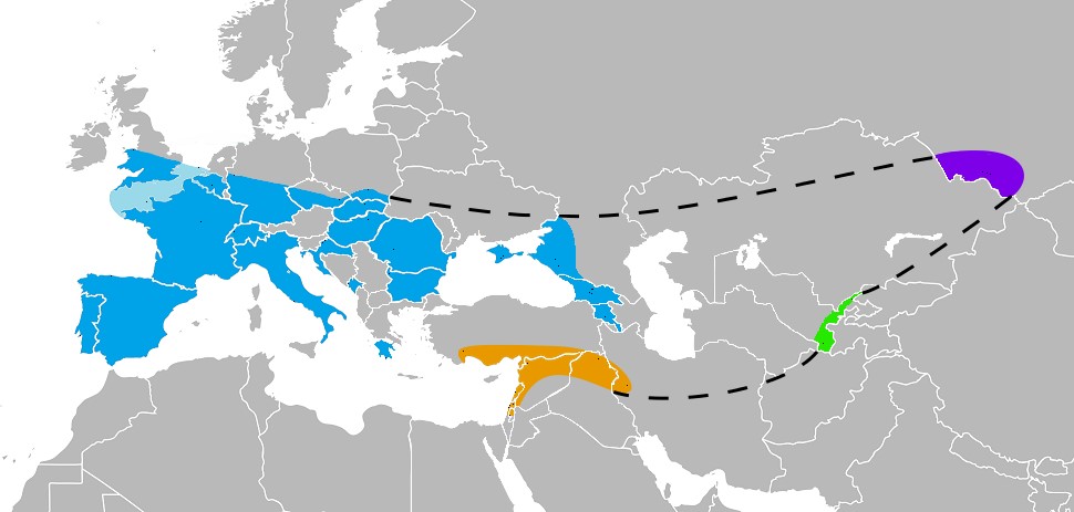
The Extent of the Neanderthal Habitat

The map below indicates where skeleton remains of Neanderthals had been found as of 2017.

Known Neanderthal range in Europe (blue), Southwest Asia (orange), Uzbekistan (green), and the Altai mountains (violet), as inferred by their skeletal remains (not stone tools). There were 165 such places by 2017. Nilenbert, N. Perrault, auteur du guide complet du canotageI, CC BY-SA 3.0 <http://creativecommons.org/licenses/by-sa/3.0/&gt;, via Wikimedia Commons

Other Neanderthal Facts

There are a lot of other interesting and surprising facts about Neanderthals, such as:

  • They lived in caves, but they also built shelters.
  • They had complex tools and skills, cooked and processed food and created art and jewelry, cooked glue, and had musical instruments (for example a bone flute).
  • Neanderthals not only used fire, they were able to control and maintain fire, and they used it to cook food, make tools, and for warmth and shelter.
  • Neanderthals were stockier and more muscular than modern humans, with broader rib cages and shorter limbs. This helped them conserve heat and survive in the cold environments in Europe and Asia during the ice ages.
  • They might have spoken language.
  • There’s evidence that they were seafaring as far back as 200,000 to 150,000 years ago.
  • Their brains were larger than ours. The braincases of Neanderthal men and women averaged about 1,600 cm3 and 1,300 cm3, respectively, which is considerably larger than the modern human average (1,260 cm3 and 1,130 cm3, respectively).
  • They had medical knowledge. They had knowledge of medicinal plants and well-healed fractures on many bones indicate the setting of splints. They also knew how to treat wounds.
  • They hunted big game.
  • They interbred with modern humans.

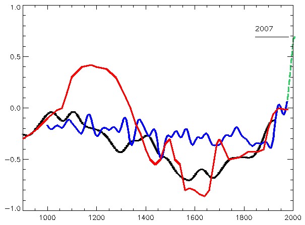
The Cause of the Ice Ages

Regarding the Ice Ages, which were a great challenge to Neanderthals, they are caused by earth’s orbital cycles. However, keep in mind that does not mean that orbital cycles are causing the current rapid global warming. NASA keeps track of the orbital cycles, and they should slowly be causing a cool down right now, not a  rapid warming. In addition, if the warming was caused by orbital cycles (or the sun), the upper troposphere would be warming as well as the lower troposphere.

However, what we are seeing is a warming of the lower troposphere and cooling of the upper troposphere consistent with greenhouse gas emissions causing the warming (the blanket effect). To read more about what is causing the current global warming, click here.

Illustration of Milankovitch cycles from MIT’s Climate Primer.

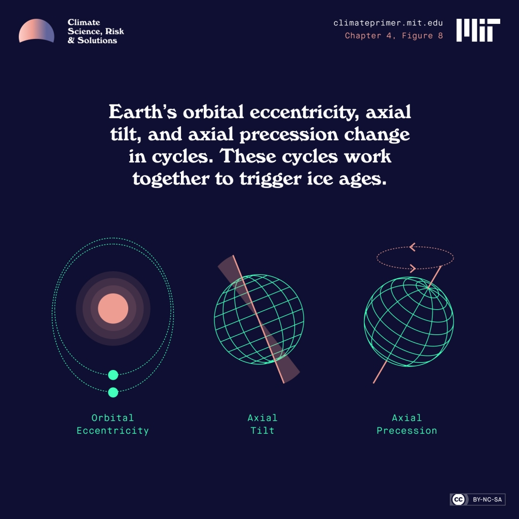
Above from PBS explanation and overview of earth’s three orbital cycles.
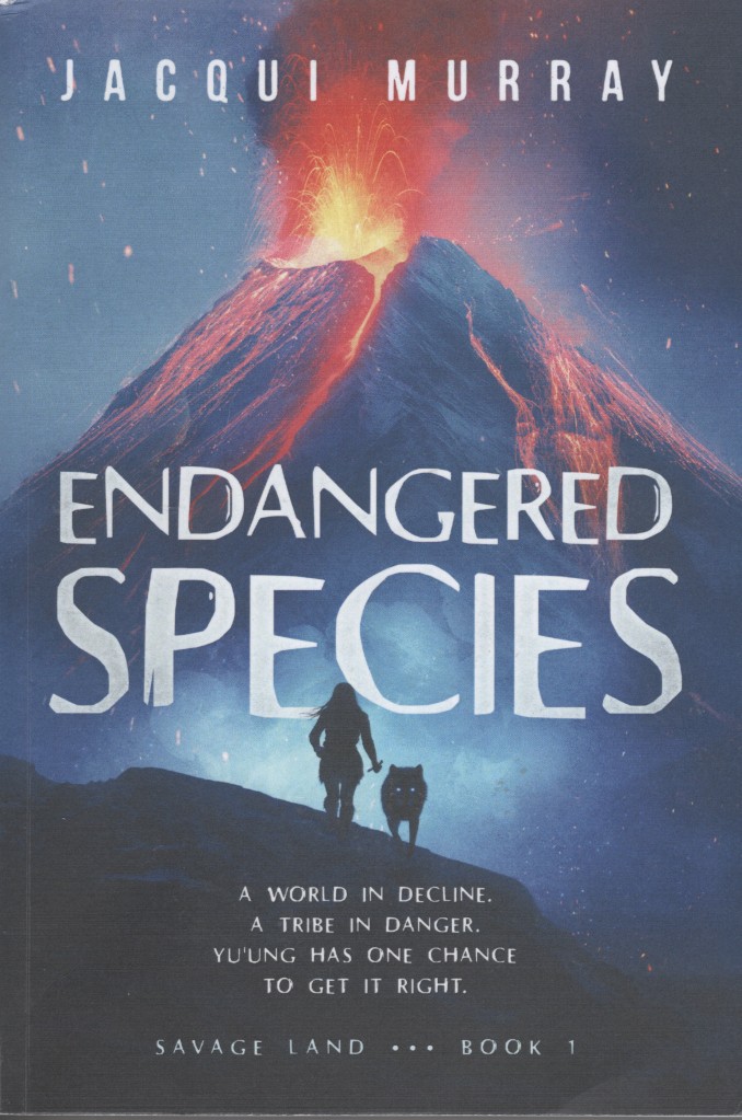
Endangered Species

When I was a teenager, I read a few of Jean M. Auels novels about pre-historic humans.  I loved them and I saw the movie. Now I am reading Jacqui Murray’s novels about pre-historic humans. Jacqui Murray’s books are even more fascinating and very realistic and well researched.

The latest Jacqui Murray book I’ve read is Endangered Species, the first book in her new series Savage Lands. This book is set to take place 75,000 years ago among Neanderthals and ancient Homo sapiens. I love all her books, but especially Endangered Species. I was also happy that she included canines as heroes in the book (Ump, White Streak, etc.) I am a dog lover after all. I can add that at the end of the book there are a lot of interesting Neanderthal Facts.

You can read my Amazon review for Endangered Species by clicking here and you can read my Virtual Book Blast post for Endangered Species (promoting this book) by clicking here. All the Virtual Book Blasts for Endangered Species feature interesting Neanderthal facts. To see a few more Virtual Book Blasts for this book click on the links in the list below.

  • Virtual Book Blast for Endangered Species – Darlene Foster – Click here
  • Virtual Book Blast for Endangered Species – Liz Gauffreau – Click here
  • Virtual Book Blast for Endangered Species – Carol Cooks – Click here
  • Virtual Book Blast for Endangered Species – John Howell – Click here
  • Virtual Book Blast for Endangered Species – Booomcha, Kymber Hawke – Click here
Front cover of Endangered Species. Click on the image to go to the Amazon page for the paperback version of the book.
To see the other Super Facts click here

Measuring Alcohol by Volume in Home Brews

Image above by Kevin from The Beginning at Last

This is a submission for Kevin’s No Theme Thursday

Beer Styles

Look at that happy and friendly beer muse above. That is Kevin’s picture. Wouldn’t you like a beer? I like beer and I also brew beer at home. My dog Rollo loves it when I spill wort on the kitchen floor. The wort is what you have before fermentation. It is like a grainy sticky sweet soup, and he likes to lick it up. However, my wife does not like it when there’s sticky wort all over her kitchen floor and the stove. Everyone has their own perspective.

Rollo in the kitchen hoping for the wort to boil over or spill.
This is an IPA that I brewed at home, and it came out pretty good. Look how happy my beer garden gnome is.

Beer is one of the oldest alcoholic beverages in the world, dating back over 7,000 years to ancient Mesopotamia. There are more than 100 different styles of beer worldwide, with the main categories being lagers and ales. The beer advocate currently lists 120. Below are a few examples of Lagers and Ales.

Lagers : Pilsner, Märzen (Oktoberfest), Adjunct Lager, Pale Lager, Scwarzbier (a black lager), Bock.

Ales : IPA, Stout, Porter, Wheat Beer, Belgian Beer, Blonde Ale, Saison, Barley Wine, Lambic, Geuze

Brewing Beer at Home

When you brew beer at home you start by boiling the wort. You boil water and you add the malts and the hops for the flavoring and the aroma at specific times. This all depends on the recipe you are following. Warning! The wort easily boils over. Then you cool the wort (I use an ice bath to do this), add the yeast, and you let it ferment, typically for a couple of weeks.

You can add various things for flavoring, such as whiskey infused wood chips if you want your beer to have a taste of whiskey and wood (yes, I have done that). Whiskey and wood are great added flavors in stouts. After the two weeks of fermentation, you add sugar and bottle the beer and let it ferment for a few weeks before you put it in the fridge.

Boiling wort on the kitchen stove. It contains water, malts, hops, and maybe sugar or honey.

A few words about the bottling process. The bottling process below is using siphoning instead of pouring to achieve some filtering and to avoid splashing. Splashing can cause excessive oxidation which can ruin the beer the same way bananas turn brown. This seems to matter for New England style IPAs, but not so much for other beer styles (my observation).

Here I am bottling beer while drinking a renowned IPA called Pliny the Elder, one of the best India Pale Ales in the world.

Measuring the alcohol content in home brews

When you brew beer at home you don’t have the advanced equipment that breweries sometimes do so measuring the alcohol content is a challenge. However, you can do it with an indirect method using a hydrometer. I will explain how to do this. There are instruction booklets, books and online websites that explain how to do this, but I will keep it short and succinct.

During the fermentation process, yeast converts sugars into alcohol (and carbon dioxide). As the sugar is used up, the wort slowly becomes less dense. By measuring the density before and after fermentation (using the hydrometer), you can calculate how much alcohol is in the finished beer. In the beer world this is called measuring the gravity, not to be confused with the fundamental force of attraction between objects with mass. You can buy a hydrometer in a lot of places including Amazon.

This is a measuring cup (left) and a hydrometer (right). Don’t worry about markings on the measure cup. It is the markings on the hydrometer that you use.
Close up of a hydrometer.

The density/gravity of water is used for reference as 1.000. To be exact, it also depends on the temperature, but for now we’ll ignore that. After the initial boil of the wort, and before you add the yeast, there is no alcohol in the wort. This is a good point to measure what is called original gravity (OG).

I should mention that you need to let the wort cool off before doing your measurement. The temperature at this point should be around room temperature, 72 degrees (60 to 75 degrees). Then after fermentation (in your container, carboy, whatever) you measure it again. This is called the final gravity (FG).

Original gravity/density Was 1.072. Final gravity/density was 1.018 (in picture).

I should add that after the fermentation in your container/carboy is done you add a little bit more sugar (called priming sugar), you bottle the beer, and you let it ferment a little bit more, which will add a little bit more alcohol as well as carbon dioxide. You want some carbon dioxide in the beer but not too much. This extra amount of alcohol is not accounted for using the final gravity. However, it is typically around 0.2% and if you wish to include it, you can just add that number.

Using the original gravity (OG) and the final gravity (FG) you can now calculate the ABV, Alcohol by Volume, by using the formula below. For this brew, an IPA (India Pale Ale), I got OG = 1.072 and FG = 1.018. Ideally FG is around 1.010, but for whatever reason I did not get there.

ABV = (OG – FG) x 131.25 = 0.054 x 131.25 = 7.1%

So that would be 7.3% with the bottle fermentation. That is a good enough measurement, but if you want precision, there is a more exact formula.

ABV = (76.08 x (OG – FG) / (1.775 – OG)) * (FG/0.794) = which in my case yields ABV = 7.23% which would yield 7.43% with the bottling. I can add the recipe predicted ABV = 7.5%. There are even more exact formulas that account for the temperatures at the points of measurement of original gravity and the final gravity. But that would be really nerdy.

To see the Super Facts click here

The Hockey Stick Graph is not Wrong

Superfact 26: The disputed Hockey Stick Graph showing that recent global warming is unprecedented in the context of the past thousand years has been shown to be correct.

The Mann, Bradley, and Hughes hockey stick curve published in 1998 in Nature and showing a sharp upturn in global temperatures in recent years as well as relatively flat temperatures in the previous 1,000 years, ignited a firestorm.

Initially some scientists criticized it for being wrong, and the rightwing media and think tanks, and especially politicians criticized the graph and even attacked the scientists involved accusing them of being frauds. Al Gore was harshly criticized for using the hockey stick in his documentary “an inconvenient truth”. There were congressional hearings, politicians intimidating scientists, fake scandals, threats, and lawsuits.

The propaganda campaign against the hockey stick graph succeeded in winning over the public and that included me. I was for the longest time convinced that the hockey stick graph was wrong and perhaps a fraud. I was wrong. I had been bamboozled just like large segments of the American public.

The scandal around the hockey stick curve and the related climate-gate (fake scandal) was used to question the entire concept of global warming / climate change. As you may know, the evidence clearly shows that global warming is happening and is caused by us.

It should be noted that the way Mann, Bradley, and Hughes implemented their statistical analysis was not 100% correct, but the discrepancy was very small and did not make a big difference. However, this discrepancy was very useful for their detractors.

The controversy led to an investigation resulting in the so-called North Report. The 2006 North Report published by the United States National Academy of Sciences endorsed the MBH studies with a few reservations.

Subsequent research has resulted in more than two dozen reconstructions, using various refined statistical methods and combinations of proxy records. They are not identical to the original hockey-stick graph but closely resemble it and consistently show a slow long-term cooling trend changing into relatively rapid warming in the 20th century.

Since there is now a scientific consensus supporting the hockey stick graph, it is important news, and a lot of people still have not gotten the memo or are refusing to believe it, I consider it a super fact.

Before The Hockey Stick Graph

Before the hockey stick curve there was a lot of talk about the medieval warm period and the little ice age. Many people used these periods to cast doubt on global warming claims by scientists. I should say that the climate scientists claim about global warming was not based on the temperature record for the last 1,000 years. It was because the observed recent uptick in average global temperatures was not expected naturally.

Their worries were based on the fact that our greenhouse gas emissions could explain the uptick whilst there was no climate cycle or natural phenomenon that could explain it. That combined with the fact that the manner in which the warming was happening (it’s fingerprint if you will) showed that it was our greenhouse gases causing it.

So, the comparably high temperatures during the medieval warm period and the very cold temperatures during the little ice age should not have mattered much. But as you can see in the graph below, the old temperature graphs could be used by global warming skeptics.

It should be noted that previous estimates for the temperatures during the medieval warm period and the little ice age were based insufficient data and guesstimates.

The graph below from the 1990 IPCC report shows three curves, a red, a blue and a black one, and a green extension to the blue from 1998 to 2007. The red graph shows a large bulge corresponding to the medieval warm period, a significant drop corresponding to the little ice age, and a minor uptick in recent temperatures. The blue curve shows a flattened medieval warm period with only a minor little ice age and sharper uptick in recent temperatures. The green extension stretching from 1998 to 2007 shows a significantly sharper uptick in temperatures. The black curve is an alternative temperature curve by Moberg.

As you can see the estimates for the average global temperatures during the medieval warm period and little ice age were too large. When the hockey stick curve came along (next graph), a propaganda tool was diminished, which led to the media storm.

The red line is from the 1990 IPCC report and shows what was believed at the time about temperatures during the last 1,000 years. The blue line is the (MBH) hockey stick graph from 1998. Graph taken from this page. William M. Connolley derivative work: Dave souza, CC BY-SA 3.0 <http://creativecommons.org/licenses/by-sa/3.0/&gt;, via Wikimedia Commons
The so-called hockey stick curve depicting the last 1,000 years. The blue line is the first hockey stick curve ever created (by Michael Mann). He used proxy measurements such as tree rings, green-dots 30-year average, red temperature measurements. Wikimedia commons <<https://creativecommons.org/licenses/by-sa/4.0/deed.en>>. This graph is taken from this page.

Multiple Hockey Stick Graphs

As mentioned, various refined statistical methods and combinations of proxy records, has resulted in another couple of dozen hockey stick curves that largely agree with the original MBH hockey curve. Below are a few examples taken from various sources. The first two graphs below are taken from the real climate website, a website created by climate scientists.

IPCC 3rd Assessment Report

Side-by-side comparison of the (left) original Mann et al (1999) “Hockey Stick” reconstruction as featured in the Summary for Policy Makers of the IPCC 3rd Assessment report (2001) and the (right) longer, sharper “Hockey Stick” as featured in the Summary for Policy Makers of the IPCC 6th Assessment report (2021).

Eight Hockey Sticks by New Scientist

The graphics below are focused on the northern hemisphere. The top graph shows the 2001 IPCC hockey stick curve with data from thermometers (in red). Below that graph are eight more hockey stick curves plus a red dotted line corresponding to the instrumental record. This was compiled for New Scientist by Rob Wilson of the University of Edinburgh, UK.

The top graph shows the 2001 IPCC version of the hockey stick curve stretching back 1,000 years. The error bars (in grey) show the 95% confidence range. The blue line is from tree rings, corals, ice cores and historical records. All curves correspond to the departures in temperatures in centigrade from the 1961 to the 1990 average.

The Hockey Stick Wars

I also wanted to add a few examples related to the propaganda wars against the first hockey stick graph and its author Dr. Michael Mann and climate science in general. If you haven’t followed this topic, I can add that it did get intense.

On April 23, 2010, Virginia Attorney General Ken Cuccinelli issued a Civil Investigative Demand (CID) to the University of Virginia (UVA). The CID demanded that UVA provide every email, record, or document it had related to Dr. Mann from his time there from 1999 to 2005. This resulted in a strong reaction from the scientific community.

On 2 March 2012 the Supreme Court ruled that Cuccinelli as Attorney General had no legal authority to demand the records from the university. Dr. Mann was also severely harassed and received chilling death threats against himself as well as his family, as documented in his book “The Hockey Stick and the Climate Wars: Dispatches from the Front Lines”.

In February 2024, Michael Mann won a defamation lawsuit against conservative writers Rand Simberg and Mark Steyn (Mann v. Competitive Enterprise Institute). The jury awarded Mann $1 million in punitive damages and $1 in compensatory damages. The lawsuit was over blog posts written by Simberg and Steyn that accused Mann of manipulating data in his famous “hockey stick” graph. It was not so much about questioning the science but rather about the fact that they intentionally tried to ruin his reputation using false information.

For example, they were comparing him to the infamous pedophile Jerry Sandusky. Jerry Sandusky was a football coach at Penn State University and Dr. Michael Mann is a distinguished Professor of Atmospheric Science at Penn State.

To see the other Super Facts click here

The Special Theory of Relativity by David Bohm

The goal of this blog is to create a list of what I call super facts. Super facts are important and true facts that are nevertheless highly surprising to many, disputed among the public, or unnecessarily misunderstood. They are special facts that we all can learn something important from. However, I also make posts that are not super facts but feature other interesting information, such as this book review and book recommendation.

The Special Theory of Relativity by David Bohm

David Bohm a close colleague of Albert Einstein was one of the most interesting theoretical physicists of the 20th century. This book “The Special Theory of Relativity” is one of the most interesting and thorough introductory books on the Special Theory of Relativity that I have come across. It is a series of lectures on the topic. It features algebra, equations, and a little bit of differentials but not too much.

You may want to have some math, physics and some relativity under your belt before you tackle this book. In my estimate it is written for those who have taken high school AP physics and AP algebra, maybe calculus as well, or one or two college level physics classes and math classes (or more). It is probably too basic for professional physicists, but it is not written for laymen. I bought the paperback version.

  • Hardback –  Routledge; 1st edition (October 10, 1996), ISBN-10 : 0415148081, ISBN-13 : 978-0415148085, 256 pages, item weight : 13.6 ounces, dimensions : ‎ 5.75 x 0.75 x 9 inches. It is out of stock, and it costs $75.60 – $144.00 on US Amazon. Click here to order it from Amazon.com.
  • Paperback –  Publisher : Routledge; 1st edition (September 4, 2006), ASIN : 0415404258, ISBN-13 : 978-0415404259, 304 pages, item weight : 12 ounces, dimensions : 5.08 x 0.69 x 7.8 inches. It is out of stock, and it costs $12.36 – $17.21 on US Amazon. Click here to order it from Amazon.com.
  • Kindle –  Published : Routledge; 1st edition (September 29, 2015), ASIN : B009W3W6MG, 306 pages, it costs $10.10 – $13.77 on US Amazon. Click here to order it from Amazon.com.
Front cover of the paperback version of The Special Theory of Relativity by David Bohm. Click on the image to go to the Amazon page for the paperback version of the book.

Amazon’s Description of the Book

In these inspiring lectures David Bohm explores Albert Einstein’s celebrated Theory of Relativity that transformed forever the way we think about time and space. Yet for Bohm the implications of the theory were far more revolutionary both in scope and impact even than this. Stepping back from dense theoretical and scientific detail in this eye-opening work, Bohm describes how the notion of relativity strikes at the heart of our very conception of the universe, regardless of whether we are physicists or philosophers.

This is my five-star review for The Special Theory of Relativity

Note, I wrote this review in 2014, so it is relatively old, pun intended.

Lorentz Electrodynamics, Special Relativity, and our Perception of Reality

This book is a thorough and well written introduction to the “Special Theory of Relativity”. In addition to the basics of special relativity it covers the history of Special Relativity and it includes 60-pages of Lorentz Electrodynamics. The book also discusses Minkowski Diagrams, the Twin Paradox, relativistic Doppler effects, K-Calculus, and philosophy related to relativity. The book does not discuss General Relativity.

Bohm does not derive many formulas for electrodynamics, optics, quantum physics, thermodynamics, etc., and therefore this book does not resemble a textbook. Bohm’s focus is on a deeper understanding of the special theory of relativity itself, and on time and space.

He discusses perception of reality and includes discussions on child development, psychology and neurology related to perception, the meaning of the relational concepts in relativity, the structure of scientific revolutions (T.S. Kuhn), our perceptions of time and space, philosophy, and other related topics that cannot be classified as physics.

In K Calculus you draw the world lines of light pulses sent at constant intervals between different observers. Then you calculate what is essentially the Doppler factor K and uses it to explain what is going in relativity. In contrast the Lorentz transform is concerned with the space-time coordinates that you measure after taking into account that light have to travel a certain distance and that this takes time. Basically, the “actual time and space coordinates”.

K Calculus on the other hand is including both relativistic effects and the distance and time it takes for light to travel. K Calculus is thus not what you “measure” but what you “observe”. K Calculus makes it very easy to explain special relativity to an audience that is not strong in math and it also adds a new understanding to the special theory of relativity.

However, I see an inherent risk with K-Calculus in that it can end up fooling the student into believing that he understands relativity, for example, if a student incorrectly comes to believe that time dilation is some form of Doppler Effect.

Except for the fact that some of the mathematical derivations were unnecessarily complex I thought this book presented relativity lucidly, the philosophical discussions were insightful, and it added to my understanding of the topic. It should probably not be your first book on Special Relativity but it is a very good second book. I highly recommend it for those who want to think through the concepts of relativity a little deeper.

Back cover of the paperback version of The Special Theory of Relativity by David Bohm. Click on the image to go to the Amazon page for the kindle version of the book.

To see the Super Facts click here

The Great Sun and Moon Spectacle

We are all in our places with sunshiny faces  ready to experience the astronomical event of the century, a spectacle that Mr. Sun, Sun, Golden Mr. Sun and the moon provided for us.

This is a submission for Kevin’s No Theme Thursday

Image by Kevin from The Beginning at Last

For us in Dallas, Texas, 2024 was the year when the sun and the moon put up an unforgettable spectacle for all of us to see. On April 8, 2024, the sun and the moon and earth lined up perfectly so that the moon fully covered the sun. We had a total solar eclipse, and we were lucky with the weather. I can add that experiencing a total solar eclipse is quite different from experiencing a partial or annular solar eclipse. I’ve experienced a partial solar eclipse as well and I can attest to the difference.

Unlike a partial eclipse, it gets dark during a total solar eclipse, the stars come out if the sky is clear like it was. The birds and the insects become quiet. It happens very suddenly, in just a few seconds. The total solar eclipse lasted four minutes.

The Motion of the Sun and the Moon

To understand what a solar eclipse is, the video below might help. What you see is the moon and the earth as seen from the sun’s viewpoint. We see earth all lit up by the sun, like a full moon, and we also see the moon lit up by the sun. 

In this situation, when the people on earth look up in the sky, they see the sun, but they don’t see the moon, even though it is there. It is a new moon, or a black moon if it happens twice in the same month. As the moon begins to partially cover the sun the shadows on the ground start looking different and if you use solar eclipse glasses you can see the sun disappearing and looking like a bright crescent, but it is still daylight and looking at the sun without eclipse glasses would just hurt your eyes.

Well, this is true until the sun is fully covered by the moon. When that happens, the light turns off and at that point it is safe to look at the sun without glasses. What you’ll see is a pitch-black circle in the sky surrounded by wispy faint lights. Those wispy faint lights are the sun’s corona.

Below is a youTube video showing an animation composed of actual satellite photos by NASA.


Solar Eclipse Preparation

I drank a very special beer for the occasion, a Trappist Belgian Strong Ale, or Quadruple, called Westvleteren 12 from Brouwerij Westvleteren (Sint-Sixtusabdij van Westvleteren).

Our patio table. The little brown packages contain AAS / ISO certified solar eclipse glasses.
Our daughter holding a Westvleteren 12 glass with a bow. Grandpa and grandma in the background.
Rollo our mini-Australian Shepherd on the patio.

The Partial Eclipse Phase

It was partially cloudy during the partial eclipse, but we were able to get a good look at the eclipse as it progressed. As mentioned, to see the partial eclipse, you have to use good solar eclipse glasses. It is primarily for safety reasons, but it is also pointless to look at the sun during a partial eclipse. You won’t see the eclipse crescent because the powerful light from the sun overwhelms your view.

I had a little filter that was placed in front of my phone camera as I took a few pictures. Admittedly they were pretty bad. I have an old Samsung Galaxy S8+ but even using newer phones it is difficult to get decent photos of something like this.

Partial eclipse photo taken with my old Samsung Galaxy phone and a filter.

The Total Eclipse

At 1:40PM Dallas time the total solar eclipse happened and luckily it was not covered by clouds. At this point it suddenly got dark and it was safe to look straight at the sun without using the eclipse glasses. The total eclipse lasted four minutes. I have included a shutter stock photo below which closely represents what we actually saw. We saw a black circle and around the black circle was a wispy white fog like light. This was the sun’s corona and it shone with about the same power as the full moon. It kind of looked like a black hole.

Except for the black background this looks like what we saw with our eyes. The sky we had was dark, like twilight, but not black. Solar Eclipse Stock Photo ID: 2344355767 by aeonWAVE

The Stars and the Planet Venus

Total solar eclipse photo that my daughter took. Can you find Venus?

Total Eclipse Photos

These eight pictures were taken with cell phones by my daughter Rachel, Denise Mosier-Wanken, and Margaret Weiss Bloebaum.

Did you see the total solar eclipse?


To see the Super Facts click here